
Impact Calendars
How I effortlessly track anything and everything…and you can too! Are you a person who needs to track a lot of stuff or a company that needs to track a lot of stuff (it’s weird that you’re a company?) or maybe an AI agent that needs to track a lot of stuff?
You’ve come to the right place!
I call it the impact calendar.

It’s mostly a temporal heatmap. It might not look like much. Neither does a lever, but it can move the world.
I’ve been automating impact calendars since at least 2019:
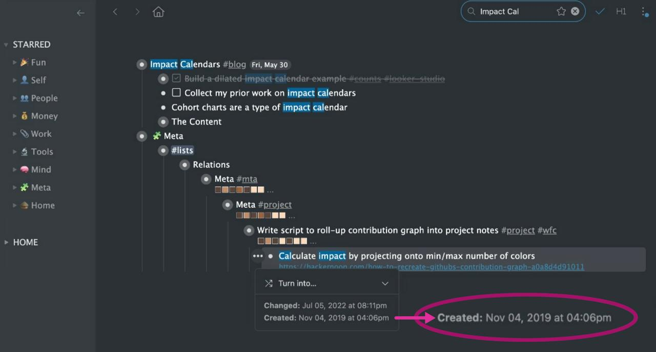
…although my interest goes back much further – more on that below.
In fact, if you look at the screenshot above, not only am I mentioning impact calendars, but the strips of brown-and-beige squares are impact calendars themselves. Using the Workflowy Extensions API, they’re inserted by a script that scans the child sections of my notes and annotates the parent with strings of unicode characters representing daily impact.
Impact calendars are great for managing almost any process (and everything is a process). In my mind, there are three things you need to manage a process:
Activities that comprise the process Tracking those process activities Someone to coordinate the first two to manage the health of the process
⚠️ C.f. REPLs, agent loops, feedback loops.
So, item #1 depends on the process, right? Managing a football team is a lot different from baking a cake. I’m not talking about #1 today.
Item #3 is maybe you or maybe a manager at your business. If it’s someone at your business, you want to be sure they’re honest and aligned with the company mission…but that’s a topic for another day.
This post is about #2. And, in particular, what if you have lots and lots of processes to track? What is a Pareto-optimized approach to managing or optimizing lots of processes?
The way that’s been working great for me for a while now is impact calendars.
Don’t break the chain
First of all, impact calendars are a great way to build a habit.
By now, everyone’s heard this one about Jerry Seinfeld…but powerful memes repeat themselves. (That’s why they’re memes!)
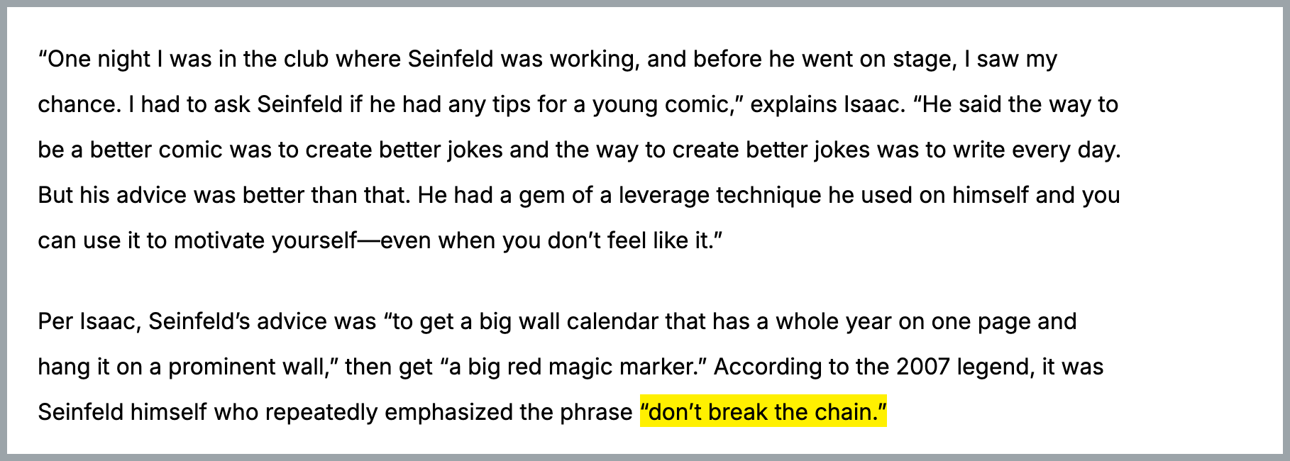
Seinfeld didn’t invent putting Xes in calendars, but he did popularize this specific and powerful warning: “Don’t break the chain”.
There is incredible value in committing to doing something every day.
Strength and conditioning coach Dan Johns likes to say, “If it’s important, do it every day” – an adage that springs to my mind often.
Impact calendars are an abstraction over Seinfeld calendars. With a computer, you can comfortably manage many more chains than you can with wall calendars. And you can do a lot more with them too!
But impact calendars are great even for tracking things that are not as important as all that.
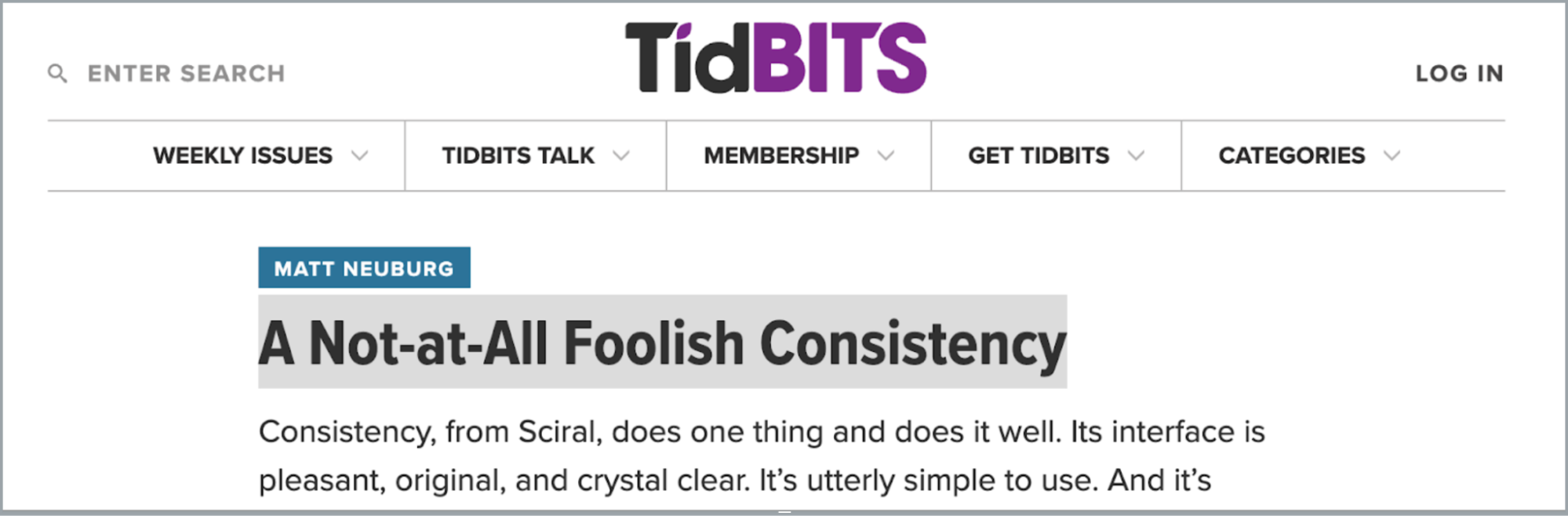
Sciral’s Consistency
Not everything is about streaks.
Some stuff you don’t do every day but you still want to track it.
Impact calendars are great for that, too!
I first started thinking about this problem when Matt Neuberg wrote about it in his review of a Mac and iOS program called Consistency[1].
The idea is that you have tasks, like maybe watering plants, that don’t need a strict schedule. The problem is, how do you let your reminders be irregular but keep the overall habit healthy?
Consistency’s answer is to provide a grid such that each row is a repeating task. The task’s schedule is a row of days where colors and symbols encourage you to execute the task within a range of configurable tolerances.
Now, ironically, I didn’t continue using Consistency, but there’s something to this, right?
There are two things I want to point out here:
- Dimensionalized calendars
We see a list of tasks. The list is the context – the top-level entity we’re tracking – and the tasks are the breakdown dimension.
We’ll talk about this more later.
- Human-in-the-loop
The information design of this layout gives the user at all times an intuitive grasp of their priorities.
Let’s talk about that right now.
Human-in-the-Loop
The problem with a lot of software is that it tries to do too much for you.
Real life is improvisational. Preprogrammed routines managed by strict and distracting alerts hinder many of us from being effective.
Sciral’s Consistency hints at a way forward: A simple visual calendar metaphor provides just enough spatial feedback to put you, the human, in control of your next action.
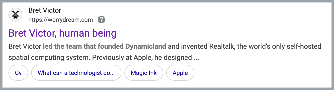
…and acclaimed CalTech computer interaction scientist, and former Apple researcher mentions this in the FAQ at his latest project Dynamicland (powered by Realtalk):
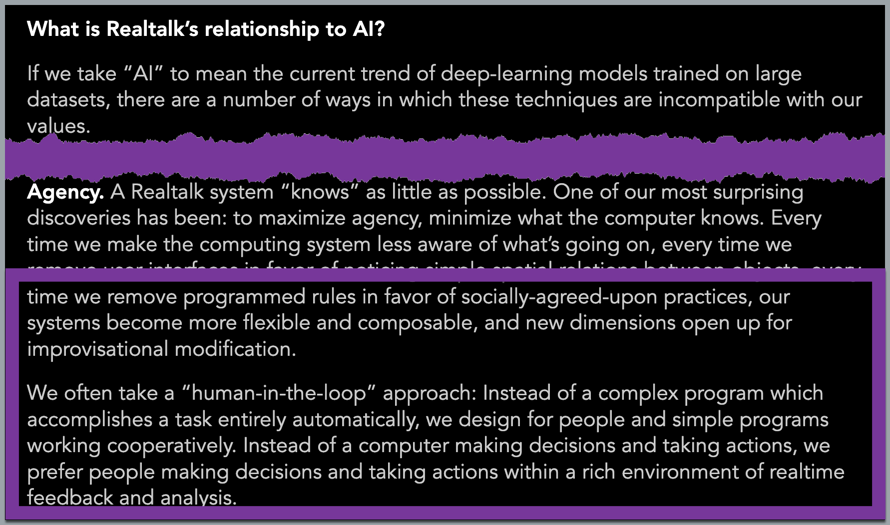
Indeed, this is also the approach impact calendars take to solving the problem of how to prioritize your efforts.
Time and task scheduling software is a cottage industry, but most of it doesn’t hold up to the dynamic needs of shifting daily demands over time.
Impact calendars, on the other hand, are a highly functional visual design for tracking stuff over time.
It is satisfying to see streaks build up. It is gamification in the simple and healthy sense of the term. Gamification doesn’t imply “gaming the system” here. It means optimizing your task/reward instincts to feel more pleasurable, like playing a game.
Offense vs Defense
It can be helpful to divide processes into defense and offense.
One way to think about it is:
Defense: The upside is fixed. As you scale effort, you reach an asymptote of value.
Offense: The upside is unlimited. The value can scale with the level of effort.
Both offense and defense are necessary. For the last few years I’ve tended toward the belief that resources should be roughly balanced between offense and defense.
Terence Tao, the world’s foremost living mathematician, recently shared the same sentiment on Mastodon:
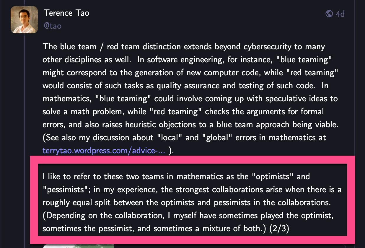
⚠️ Question: If offense has unlimited upside and defense’s upside is fixed, why would we spend the same amount of time on both? Answer: Because the worst mistakes carry existential risk, which in some sense is infinite. But this is a subject big enough to warrant its own separate post 🙂
Whatever the distribution of offense vs defense, impact calendars handle both with aplomb.
A habit of writing stand-up material every day is offense-oriented while washing your car is defense-oriented. Impact calendars can easily remind you to do a lot of the former and just the right amount of the latter.
Tracking Activities
Impact calendars are great at tracking ongoing processes, like writing every day, getting fit, or a child doing their homework.
Another word for an ongoing process is “habit”. People have habits and organizations have habits too.
If you keep up a habit for a long time, eventually you become an expert at it.
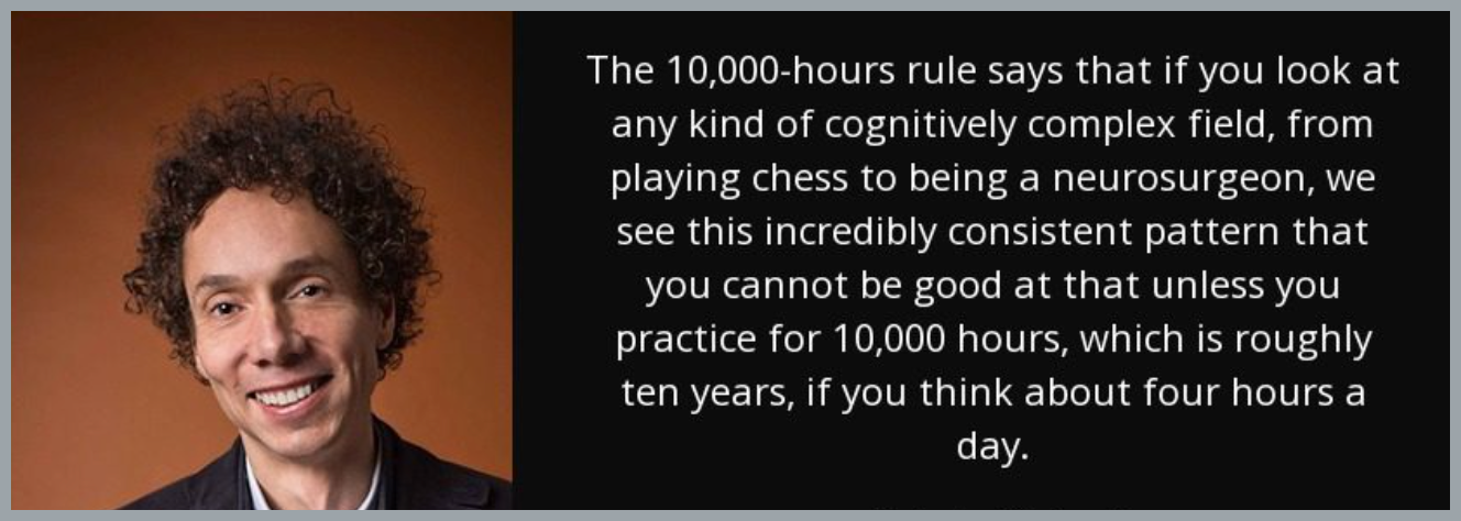
10K Hours
Everyone’s familiar with Malcolm Gladwell’s thesis from his book Outliers:
The other day I was rewatching Lex Fridman (MIT computer scientist and researcher who hosts the interview series Lex Clips) chat with Andrej Karpathy (former director of Tesla AI, founding team at OpenAI, taught the first Stanford deep learning course) and there was this exchange near the beginning:
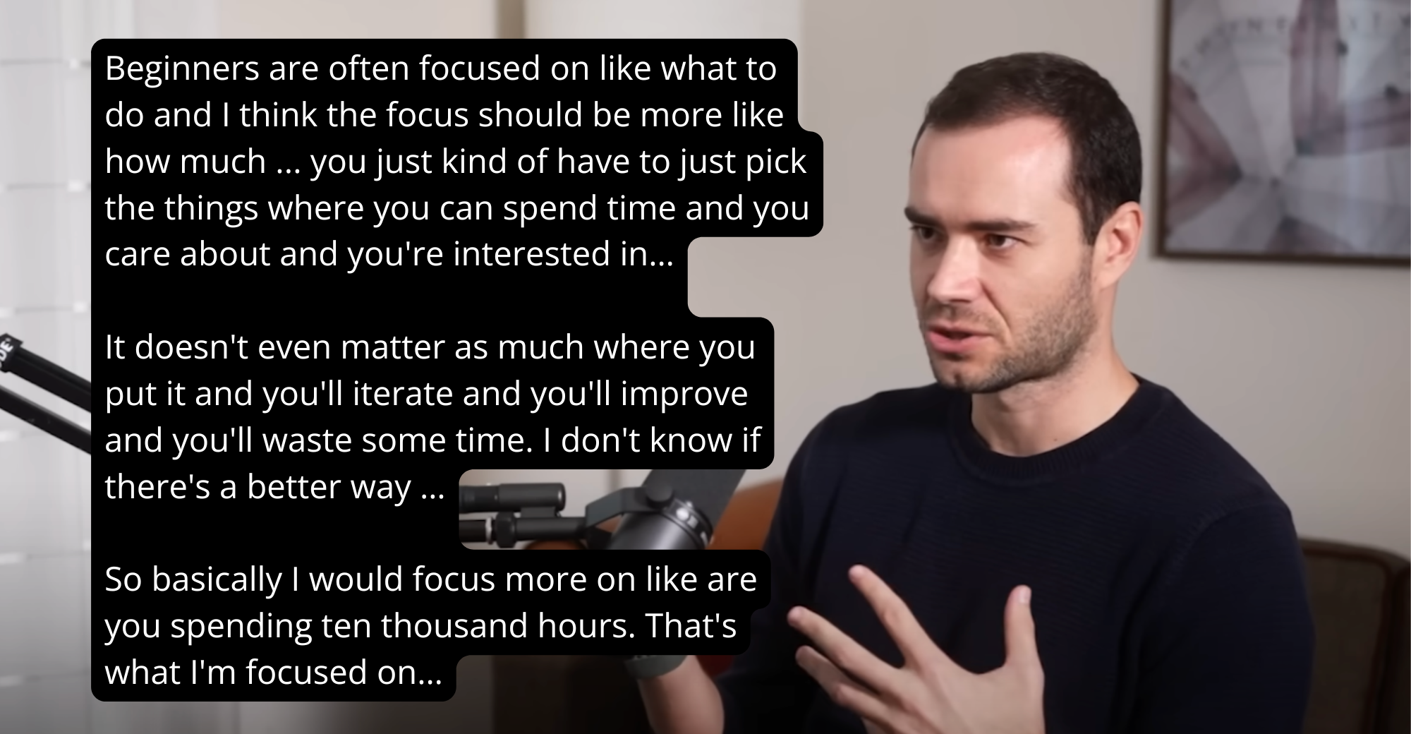
I point this out because recently there’s been backlash over the 10K figure. Is 10K really a magic number?
Reading between the lines of Andrej Karpathy’s comments here, and nodding in agreement, my take is: Who cares? That’s not the point.
The 10K hours is a modern Aesop’s fable.

Right about now, this sounds really familiar too? How can we build a habit ensuring that, over time, we expend 10K hours trying to become really good at something.
This is how you put 10K hours in perspective.
This mindset is something I first read about in a sports science textbook at school a long time ago, and it’s stuck with me ever since: According to the research, “winners” tend to make progress comparisons to themselves, not others.
(By the way, I love how correct ideas bubble up and converge over time.)
So, sure, maybe two people can both spend 10K hours and one will be better than the other.
But this is not something you should spend any time worrying about. Don’t compare yourself to others, compare yourself to who you were a week ago.
Impact calendars make it very, very easy to compare present-you and past-you because you can see the level of your activity at a glance.
Final thought here then:
It’s easy to get caught up in details, but if you start tracking activity against a goal, you get to squeeze joy even from the false starts. Mistakes and deadends get Xes on the calendar too!
In every case, you learned something and are more expert than you were before.
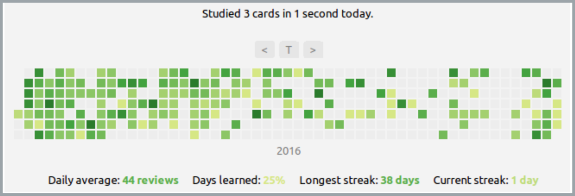
Example: Flashcard Memorization
Here’s a great example: This weekend I met up with my wife’s colleague from out of town, Sanjay, and his brother AJ. AJ is a med student at the University of Missouri who is doing research at UCLA for the summer.
We all had a very interesting conversation, but particularly AJ and I hit it off, with a shared love of singing Hozier’s “Take Me to Church”, playing basketball, memorizing stuff, and impact calendars. (If it weren’t for my wife and the whole age gap thing, I’d be asking him out for drinks 😉)
The #1 app to help med students memorize their coursework is a program called Anki. And every med student he knows installs a plugin called Review Heatmap that generates an impact calendar for them to track their consistency in studying.
I’ve heard (was it Atomic Habits?) it takes 21 days to form a new habit. So we know it's difficult to pick up new habits in a vacuum.
But what if you could multiplex your habit acquisition? With impact calendars you can.
Or, if you’re a business, you can rapidly adopt many new processes simultaneously.
Example: Programmer Productivity
Measuring programmer productivity is famously “impossible”.
A first instinct is to measure lines of code.
But we learned a long time ago that doesn’t work.
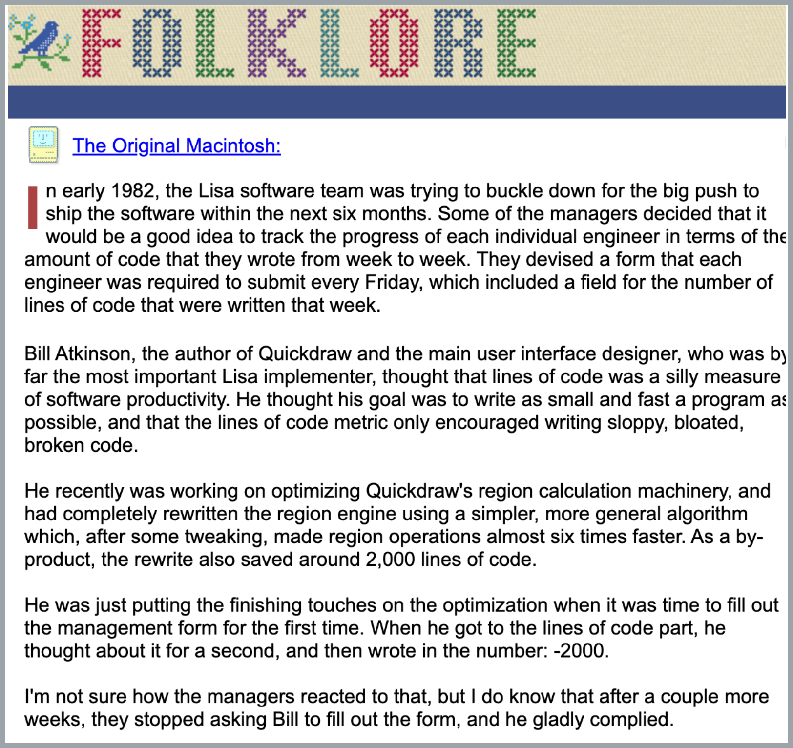
However, when GitHub took off as the number one portal for open source software collaboration, they came up with the contribution chart – and it’s stood up great over time.
Here’s GitHub’s chart for Ruby on Rails’s David Heinemeier Hansson that I clipped a while back:
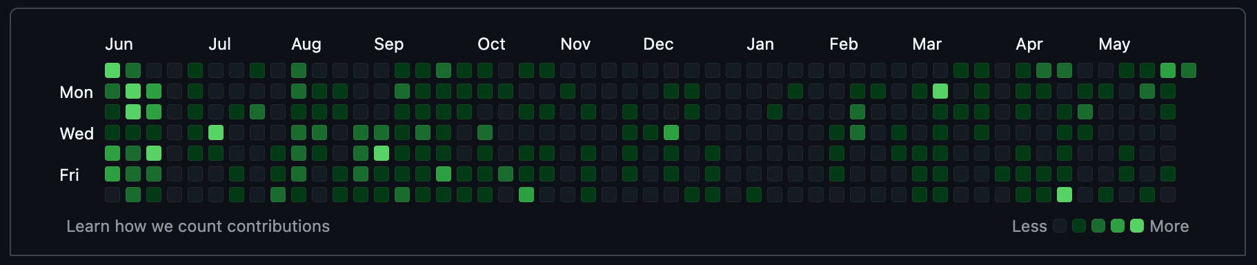
I’m not sure what all goes into it: Lines of code certainly…but also lines removed, libraries added, configuration changed, issues closed and opened, and so forth. The inputs are normalized and a min/max heatmap is applied. Its aim is to show generally how much a user is moving software projects forward.
This is sort of the right level of detail for a developer. If someone is managing a project and you check out their contributions and you see they’re consistent, it gives you confidence in the liveness of the project. It gives you confidence in their seriousness and discipline as a programmer.
Now, the contribution chart is still just one signal.
My family likes to read Marylin vos Savant’s column in the Parade Magazine insert of the Sunday paper[2]. She is wise and down-to-earth.

One time she ran a reader survey on spelling (which she later made into a book) and published the analysis in her column. I couldn’t find the column, but what she found is that the biggest factor in being a good speller was self-identifying as “well-organized”. She summed up: You can be smart and a bad speller but you can’t be a good speller and not be smart.
That’s the kind of signal the GitHub contributions chart is: You can be a great programmer and have an empty contributions chart, but you can’t have a full contributions chart and be a bad programmer.
For years now, that’s been my go to advice for up-and-coming programmers: Make your contributions chart green. “Don’t break the chain.”
Note, too, that there’s a little more going on here than when we started by talking about Seinfeld calendars. Putting an X through a calendar square is binary, but here we’re getting more signal from the colored cells. And we can just as well put numbers in those cells if the situation calls for it, too.
In fact, coming right up!
Tracking Outcomes
So, tracking activity is a great start. A lot of times, you can get all the way to where you want to go just with that.
But heatmaps can track any sort of metric, of course.
Examples
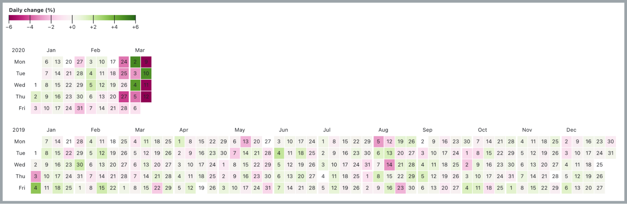
The daily percentage change in the Dow Jones Industrial index:
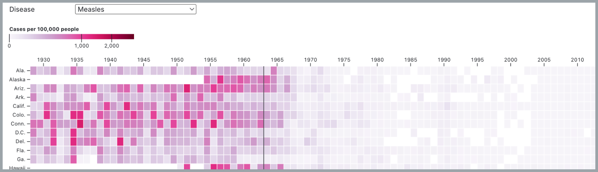
The impact of vaccines on measles cases:
What this implies is that not only can we track the impact of activities on a project, process, or habit, we can also track outcomes.
Dimensionalized Impact Calendars
The last chart on measles highlights another key advantage of impact calendars done right: Breakdowns.
In the measles chart, looking at the vertical axis labels, the breakdown dimension is US states.
Of course, it can be anything that gives insight to your data and progress toward your goals.
One really powerful example of this is the cohort analysis chart commonly used to track SaaS performance. The classic use case is viewing user retention by days since they signed up.
Time dimension – Cohort week: The week encompassing a batch of new sign-ups.
Breakdown dimension – Weeks since cohort sign-up. Even though it’s related to time, this isn’t a temporal axis because each column (1, 2, 3, etc.) represents different starting and ending dates depending on the cohort.
Until now we’ve only looked at charts where the time dimensions were plotted horizontally, so take care to note that it’s vertical here.
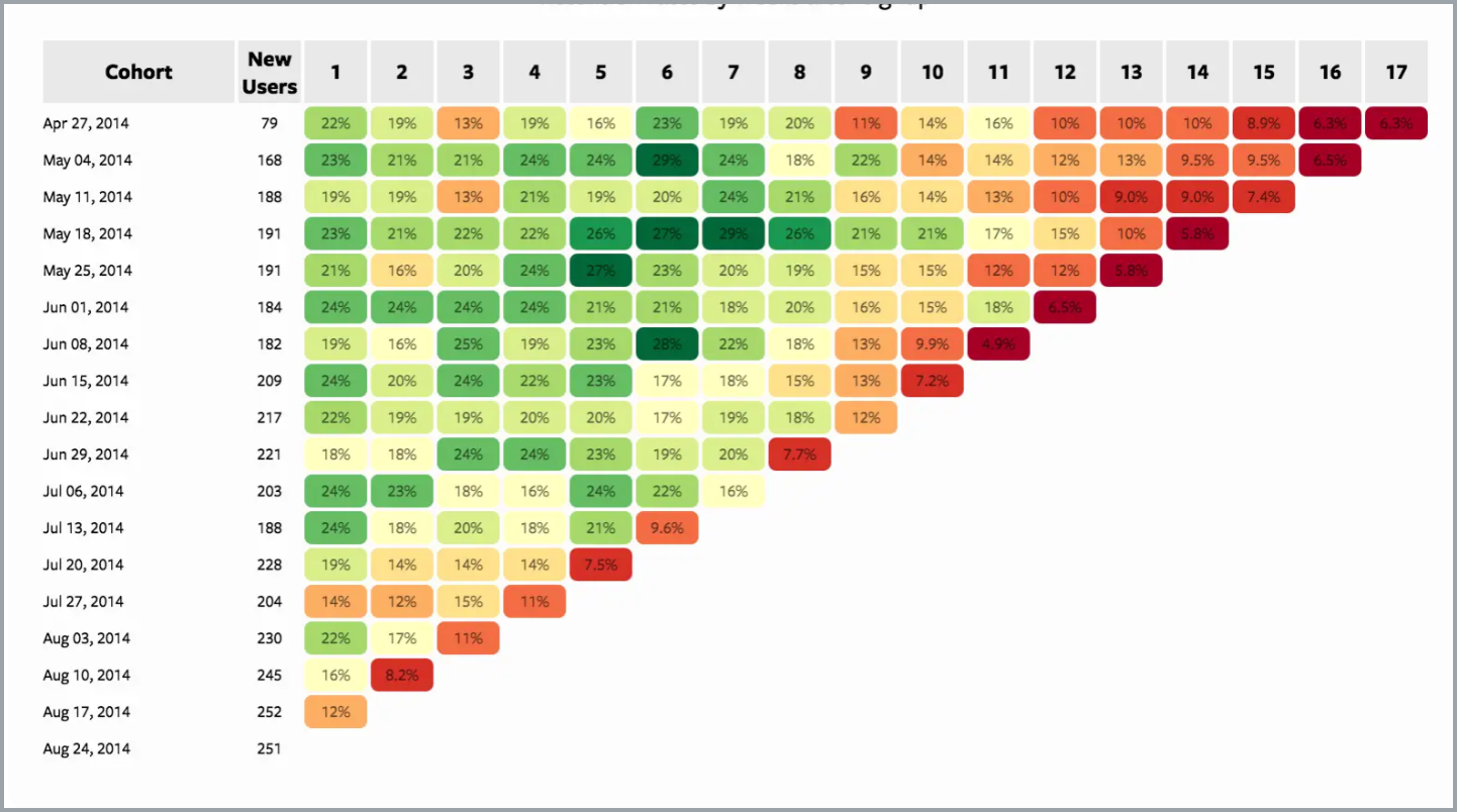
This is already pretty interesting in and of itself, but it gets extra interesting when you plot retention by actionable criteria instead of just sign-ups. For example, how does the account manager or contract size or client performance metrics affect engagement and retention?
Check out this post for some ideas and more insights.
Momentum Maps
An enhancement I’ve been playing around with lately is something I call momentum maps.
Just as objects in your rearview mirror quickly get smaller and smaller, past data gets less and less important. Recent actions and outcomes are more important to predicting where your project is going.
If your timeline of data is long, consider dilating the period granularity as the data is more recent.
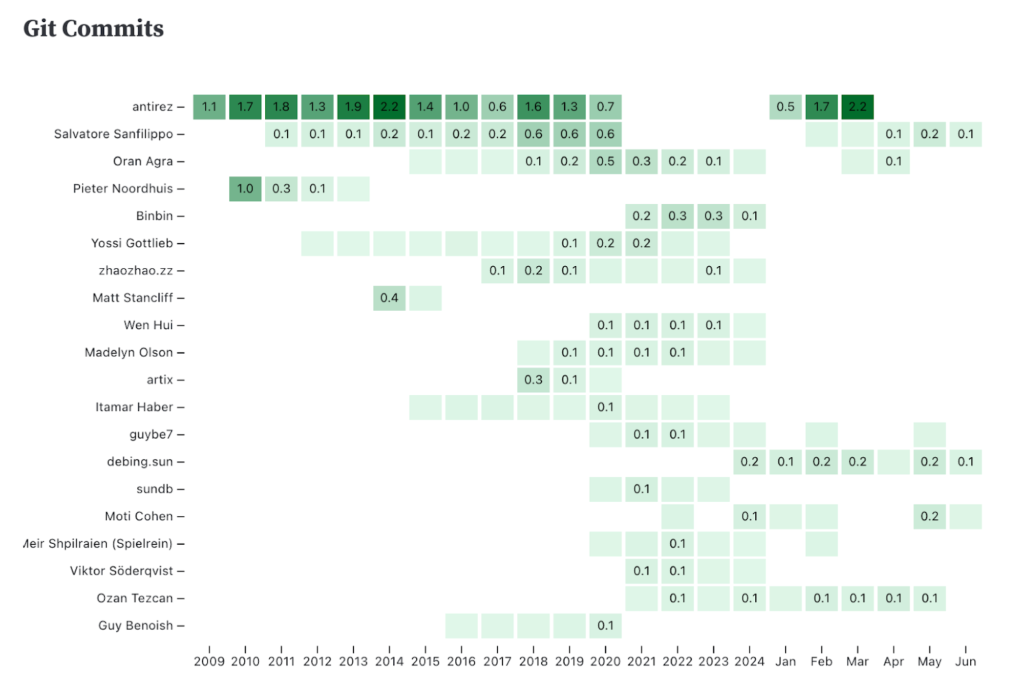
Example: Redis and antirez
Redis is an open source DB created by the Italian developer Salvatore Sanfilippo who goes by antirez. Redis became popular very quickly after its early releases.
We’ll look at the activities and performance of Redis using two correlated momentum maps.
In our first chart, we track an activity metric: Daily average code commits during the period.
From 2009-2024 our granularity is yearly and antirez was the key contributor every year in the span.
Note that during the stretch from 2021-2024, antirez did not contribute to Redis at all.
In 2025, antirez rejoined the project and began contributing again, so we’ve switched the granularity to monthly to see how this has affected the momentum of the project.
Great!
So we can tell that antirez (and the team) are expending a lot of effort – but what’s the payoff?
To know that we need an outcome metric.
The simplest way to know if an open source software project is successful is its GitHub stars. Are folks bookmarking this project?
Below is an impact calendar plotting the daily average rate of GitHub stars for the same periods as the code commits above:
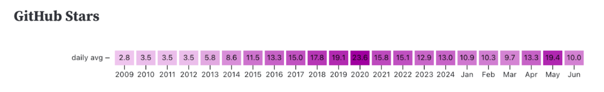
Looking at both charts together, here are some takeaways:
At a glance, from the code commits, we know antirez has been the most consistent and prolific contributor to the project.
We also see that the GitHub stars pace grew during antirez’s initial years with the project. The project grew more and more popular.
Starting in 2021, we see that antirez did not participate in the project for several years. During that period, the rate of GitHub stars waned and the popularity of Redis declined.
This year, as antirez started contributing again, he was also again the most prolific contributor.
And, perhaps not coincidentally, the pace of new stars on GitHub began growing again.
So this is pretty cool, right?
Impact calendars are great for tracking steady-state processes. Chores, basically.
But by correlating activity- and outcome-based impact calendars, we can get great visibility into growth processes from front to back.
The Metaprocess
So, a sane first pass at optimizing any process tracking could be:
-
Track that you’re doing something, anything, on a regular basis (ideally daily for growth processes). Simply engaging with the process every day is the first step toward building a healthy process.
-
Over time, you start to form ideas about what are the key activities to make this process successful. Add dimensions or impact calendars tracking specific activities you’ve found to be effective at optimizing your process.
-
Finally, where appropriate, use outcome-based impact calendars to track that your activities are achieving the desired results.
Using Your Own Impact Calendars
It can be as easy as Excel or Google Sheets or even wall papering one wall of your living room with paper calendars[3].
I’ve already gone way over budget on words, so implementation tips will have to wait for next time. I plan to release a guide to how you can implement impact calendars into your own life and work.
But think about it: What process or activity could you start tracking today, and it would be a game changer for your life or business?
One last thing:
Please be kind to yourself and be kind to others. I drop balls, you drop balls – and so does everyone else.
Some balls can be dropped and some balls can’t – knowing which is which is one important key to everything. And getting a little better at this juggling act every day is all we can ask of ourselves.
-
A couple years later, in a fun twist and after teaching myself to program with AppleScript, I contributed a couple neat tips to, and got to serve as technical reviewer for, Matt’s excellent programming manual:
By the way, am I the only professional software developer who taught themselves to program on Apple’s limited and neglected batch scripting language? That was my BASIC I guess 🚀
-
Schooling math professors on the Monty Hall problem is a favorite 😉
-
It might seem silly to have 10 wall calendars, but let me tell you about the time I tiled my entire living room wall with panelboard from Home Depot to make it a whiteboard. Pair with Mr. Clean Magic Erasers and you have a super cheap, durable, and effective whiteboard. Good times 😎